The Logo of a company is very important as it sets the first impression of the manufacturer and is the brand’s identity on all its products. Most of the manufacturers are working towards electrifying their entire lineup and want to embrace this new change in direction with their identity and what better way to start it than changing the logo. Here are 12 car manufacturers that changed their logo in recent times. Interestingly, many have chosen a previous 2D design used by them a long time ago and ditched the current 3D designs sighting digitization as a primary reason.
-
Peugeot
Peugeot New Logo on the Left This marks the 11th update to the manufacturer’s Lion emblem that has been used in one form or another since 1850, but it’s not entirely new either. The most dramatic change is the fact that this is a reboot of a similar shield-backed design used back in the 1960s. We like the black and white contrasting colours with the detailed Lion’s head silhouette design with all its mane.
-
BMW
BMW New Logo on the Left BMW is one of the manufacturers who retained the design of their logo the same since 1917. It has been tweaked here and there but nothing big enough to make a difference. It has always featured the white and blue quadrants in the middle that represent the Bavarian Free State colours, and not a spinning propellor which people usually claim. This latest update to the logo design is the most significant for the brand and was introduced with its first electric car. This design again is 2D and has a transparent outer circle, which makes it sit flush with the different colours that the beautiful cars come with.
-
Kia
Kia New Logo on the Left The new completely redesigned logo was first previewed during the Kia Imagine concept that was unveiled back in 2019 at the Geneva motor show. It is part of a grand plan by the Korean manufacturer to be considered both as being more aspirational by buyers while at the same time being a leader in new technology. The logo it replaces was a familiar old-school simplified version of the one since 1994, while the new design is radical and is claimed to inspire thoughts of “symmetry and rhythm”.
-
Nissan
Nissan New Logo on the Left The new Nissan logo was launched in July 2020 before which it had the same logo since 2001. Nissan is another manufacturer to have opted for the 2D flattened design, but it retains the original font from the old one. The company said, ” the new logo looks to the future while staying proudly connected to the company’s rich heritage and tradition of innovation.” The Nissan Ariya electric crossover is the first vehicle to come equipped with this logo.
-
Toyota
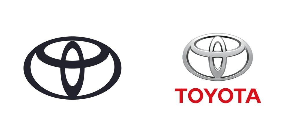
Toyota New Logo on the Left Just like the case with the others, Toyota too has ditched the 3D design along with the lettering below the logo. The new 2D look is minimal with just the logo from the previous design that was introduced in 1989. Toyota says, ” The inner ovals symbolise the heart of the customer and the heart of the company, overlapping to represent a mutually beneficial relationship and trust between the two, as well as forming a ‘T’ shape for Toyota. The outer oval one signifies the world embracing Toyota.”
-
Volkswagen
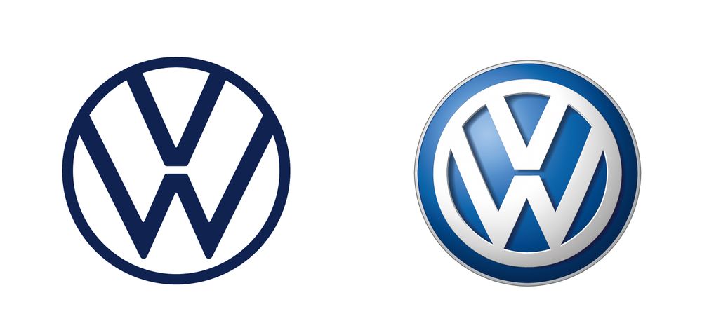
Volkswagen New Logo on the Left Volkswagen’s logo has been almost the same since the company’s founding days way back in 1937, the signature V sitting on top of a W. The letters were thrown inside a circle in 1945, and after that, the logo changed little, adopting a 3D look in 2012. This changed in September 2019, with the logo being much closer to the minimalistic 2D design VW rolled out in 1967 and the slight changes include a thinner circle and letters. It is still one of the first car manufacturers to change its logo after which other companies followed suit.
Get your car serviced at GoMechanic.
-
Audi
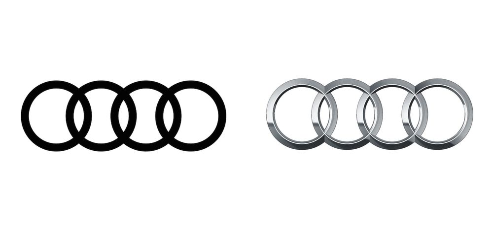
Audi New Logo on the Left Audi’s new logo isn’t quite as recent as the others here, as it happened back in March 2018. However, it was one of the first car manufacturers to change its logo and start the ‘flattening’ trend that was later followed by its fellow VW Group brand and several other companies mentioned here. We still have the four rings, intended to represent the four firms (Audi, Horch, DKW, and Wanderer) that came together in 1932 to make Audi’s Auto Union. Although, the 3D effect is gone to make what Audi calls a “digital-first” logo.
-
Stellantis
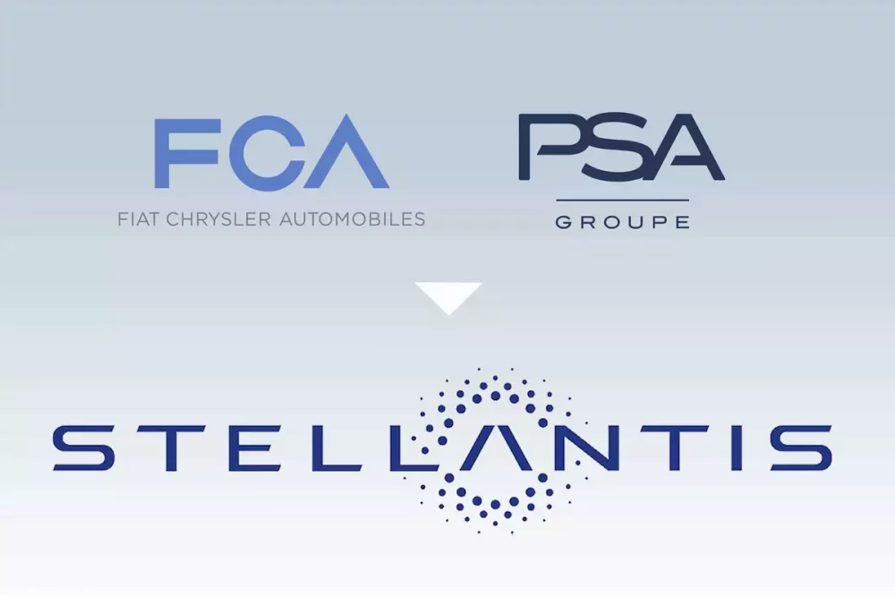
Stellantis New Logo Stellantis, an automaker newly formed by a merger between Fiat Chrysler Automobiles and PSA Group, said in November 2020 that its new logo “symbolizes the rich heritage of Stellantis’ founding companies and the unique combined strengths of the new group’s portfolio of 14 storied automotive brands, as well as the diverse professional backgrounds of its employees working in all of the regions. This will be only for the digital purpose as the cars themselves won’t be getting this name or badge but will be equipped with their respective company names.
-
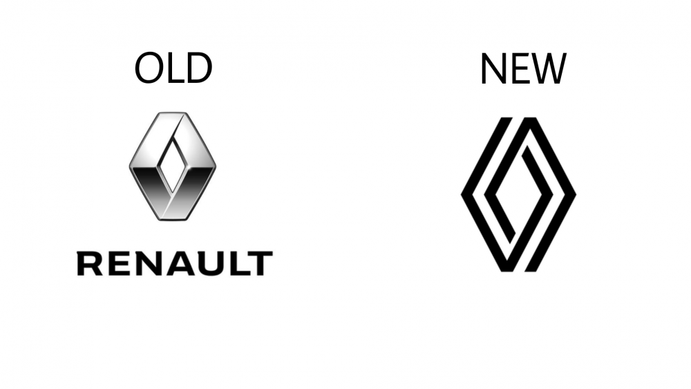
Renault
Renault New Logo on the Right Renault’s new logo was first showcased at the Renaulution event with the new Renault 5 Prototype. This change in the logo comes after 6 years since the last change in 2015. The new logo is said to embody the idea of ‘nouvelle vague’ which translates to a new wave. This is in synchronization with the company’s new objective in offering new, vibrant and modern products to its customers. Previous logos were 3D and had sharp aggressive lines while the new ‘nouvelle vague’ is a statement of technology and modernity.
-
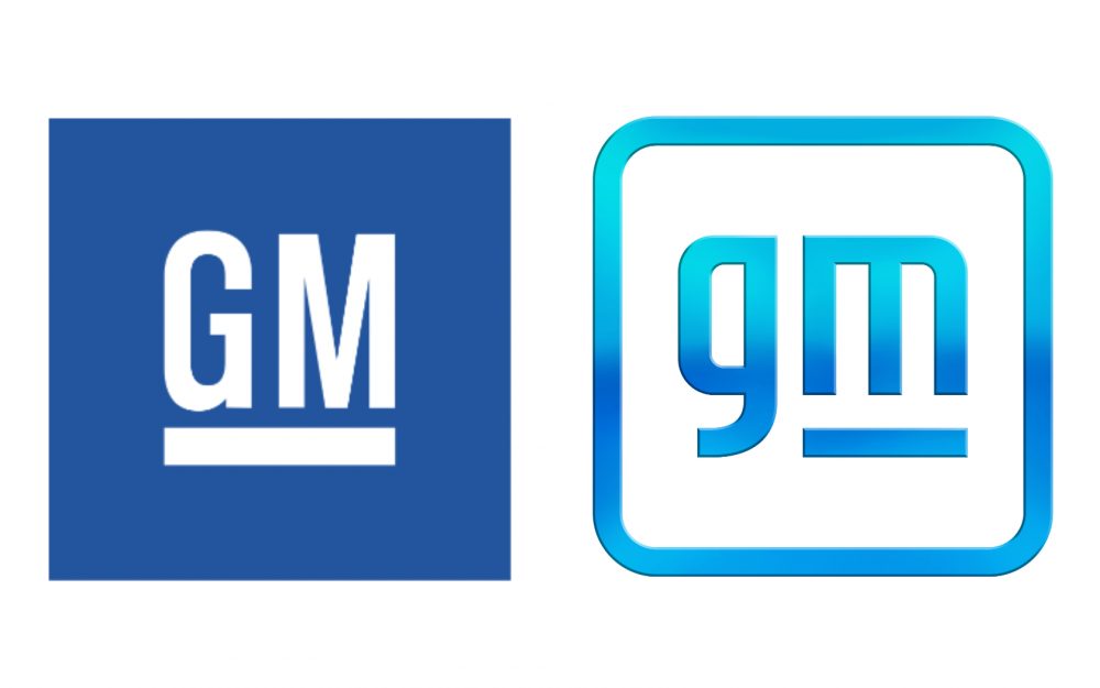
GM
GM New Logo on the Right The American automaker General Motors unveiled a new, brighter logo and a fresh ‘Everybody In’ slogan. Introducing the logo as the first step towards reinventing itself as a car-maker that ensures zero crashes, zero emissions and zero congestion. Interestingly, GM says the new logo is designed to “evoke the clean skies of a zero-emission future”, while the logo and slogan are claimed to target a new generation of buyers, accelerate EV adoption and highlight the benefits of the US manufacturers all-new Ultium platform.
-
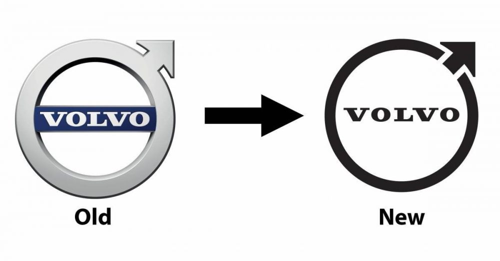
Volvo
Volvo New Logo on the Right Volvo is one of the latest car manufacturers to join the refreshed logo bandwagon with the change in its iconic ‘iron mark’ logo. The 2021 version is heavily inspired by the simple 2D logo that was used back in the 1930s. As shown above, Volvo’s redesign is to help better display its brand in an online world and in a new electrified one too. It’s been reported that Volvo will continue to use its 3D metallic chrome and blue logo on its cars and SUVs for at least another year, ahead of a switch to the new badge in 2023.
-
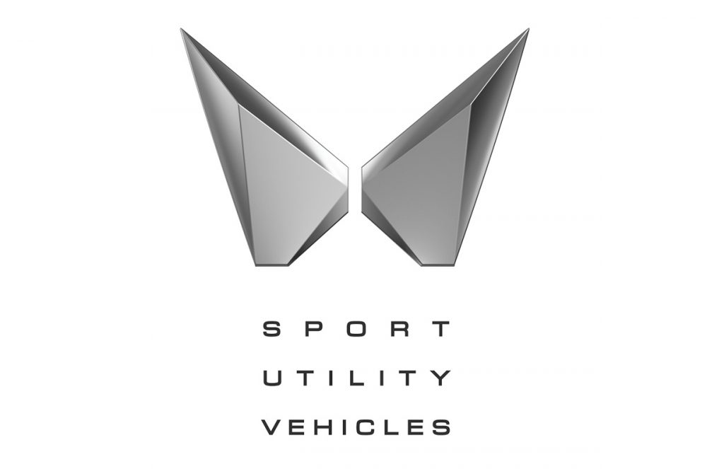
Mahindra
Mahindra New Logo Mahindra recently unveiled its new ‘Twin Peaks’ logo days before the XUV700, the first vehicle in its lineup to sport the new logo, was launched. This is an effort to provide a new visual identity to differentiate the SUV lineup in the brand’s portfolio. The creator of the design, Pratap Bose has stated, “The idea behind the visual identity change is to express that liberating feeling, that you can go where you want when you want – in complete style, control and security, taking your world with you. It brings a fresh dynamism as an exciting new era unfolds. The 2M’s within the logo symbolize an expansive and exciting future which is based on a solid heritage.” We think the new logo is nice and has a modern touch to it, which is required to deliver the news to the people that things are changing for the good.
The ongoing trend of updating or changing the logos is not a new concept as every manufacturer has either tweaked or changed the logo entirely, to suit its needs along with the direction of the company’s objectives. Now, since almost all of them are going green, with electric or other forms of reducing the carbon footprint, they want customers to believe that the new technologies implemented are not the same as before.
Each manufacturer is giving it their all to provide better products along with being polar bear friendly, which is not an easy task in itself and hence causing a revolution. This revolution needs a new face and hence companies are opting for new or updated logos to symbolize the same. We do like some of the changes, while some of them are not as good as before. Let us know what you feel about this ongoing trend with manufacturers and which manufacturer needs a desperate change in their logo as well as their product lineup.
FAQs
1. Which automaker is changing its logo?
Recently, many automakers can be seen updating their logos to match a modern, digital look and to bring a freshness. The brands like BMW, Audi, Volkswagen and Jaguar have all undergone logo updates during the last few years.
2. Has BMW changed their logo?
Yes. in 2020 BMW changed its logo. They have removed the black background and introduced flatter, more transparent design while keeping the iconic blue and white elements same.
3. Did Tata change the Jaguar logo?
Yes. Jaguar has updated its logo as part of its rebranding strategy. The new logo reflects a more modern and electric-focused future of brand. The new logo of jaguar got both love & hate reaction form the audience.
4. Did Audi change their logo?
Yes, Audi has changed its logo. They have simplified the four rings of logo. The newer version is flatter and much cleaner which designers have created for digital platforms.


